Exquisite Corpse

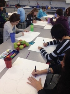
I always love watching the student’s excitement with it comes to the unveiling of the “Exquiste Corpse” project. In my first drawing class in college, we did this as a warm up activity.
Step 1: fold your paper I two thirds
Step 2: each student draws a head of any kind of creature in the top portion. It does not have to even be a living thing. The more create, the better turn out.
Step 3: each student must extend where their neck ends into the next section so that when you fold it, the head is hidden and all that remains in the middle section is two lines at the top. This helps students to know where to connect the torso and not see anything on the head portion. It’s very important to do this!
Step 4: shuffle all papers and fold them so all they see is the middle portion. Remind them constantly not to peek. (one still will) Have the students create any kind of torso imaginable. Make sure they then extend where the torso ends in the torso ends in the next section.
Step 5: Reshuffle and retold. Pass out and have student draw any kind of legs. One of my favorite turn outs was a student who drew a lamp with a genie tail coming out. It’s amazing what these kids come up with!
Last: unveil the masterpieces!

IMG_0487-0.JPG

IMG_0483-1.JPG

IMG_0467-0.JPG

IMG_0484-0.JPG

Posted in Art Education | Tagged , , , , , , , , , , , | Leave a comment

“Outside of the box” Clay Box!

Although we are mid-summer, I wanted to reflect on an amazing turn out of a clay assignment for my advanced art students this past year. We introduced clay through tiles and cups. They focused on proper detail of the tools … Continue reading

More Galleries | Tagged , , , , , , , , , , , , , , , | Leave a comment

Watercolor Still Life!

20140103-201140.jpg

Theres nothing better than learning the fundamentals of drawing and working with a new media by using a traditional still life! With great apple prices before break, the Art I students and I discussed setting up an interesting composition in our first step- our drawing.
The students drew lightly, focusing on space and placement. I always make sure my kids are aware of making a drawing interesting through cropping and off centering

We warmed up with watercolor next by practicing with layers of colors to form darker layers and maintain highlights. We created swatches of values for color mixing, practiced with salt and alcohol for added texture, and eventually practiced one apple on a separate paper and incorporated the 

20140103-201155.jpgtechniques taught. 

Many had a tendency to overwork their apple with their first start to using the paint. I find my best results are by constant process over product. Although its tedious and takes up a lot of time away from working, the outcome is so much more appreciated.  The students learned from their warm up to work very lightly

20140103-201231.jpg

throughout their final composition page, moving from apple to apple.  We are able to let areas dry before working over it again, as well as see what areas are further away that need more versus another for a better perspective of space.  What a beautiful turnout!

20140103-201241.jpg

20140103-201254.jpg

20140103-201337.jpg

Posted in Art Education | Tagged , , , , , , , , , , , , , , , , , , , , , , , | Leave a comment

Image transfer!

I sent out an email to my coworkers asking if anyone had any clear transparencies. Within an hour my mailbox was full of unused boxes
of transparencies that were happy to leave a classroom storage! They are so useful in art!20140103-133607.jpg

My 8th graders and I created multiple sketches with these categories: a scientific specimen, shoes, and snacks. They had to create their sketches using just line and crosshatching in various sizes and positions. These drawings were then traced with thin and thick sharpies on the transparencies.
We created a back

ground of our collage with printmaking paper, acrylic paint, and old gift cards. We scraped various colors of paint with the gift card to spread thin layers across our paper. Bubble wrap and card board make for great printed textures, too!

Using matte medium we arranged our cut out drawings so various images overlapped then used it like paint and 

20140103-133618.jpgbrushed it underneath and on top of the transparency drawings to stick to the background surface. We painted an emphasis color with paint underneath a few images for an extra pop!

Another great way to transfer images is through a way I never expected. Draw in a sketchbook and make multiple copies witha copier machine. Cut the images and cover with stripes of overlapped clear packaging tape on top of the inked side. Soak the image in a bucket tray of water for a few minutes. You will see the paper of the image deteriorate. Rub the paper off and the ink stays on the tape!

Posted in Art Education | Tagged , , , , , , , , , , , , , | Leave a comment

Wayne Thiebaud Painterly Paintings!

Wayne Thiebaud, an American painter, helped us to learn about Pop Art and a new palette knife painting technique for Advanced Art!
We reviewed and analyzed his various paintings on a Prezi presentation on Pop Art- http://prezi.com/cb-guvjbtoyw/present/?auth_key=p7s5nej&follow=rfozfeibi1tg&kw=present-cb-guvjbtoyw&rc=ref-48994887

Then, each student receieved a strawberry, a palette knife, palette, acrylic paint, and a small brush. They drew their strawberry on their painting and begin to incorporate the bumpy texture by lifting their palette knife on a small pool of paint, and spreading darker and lighter values without fully blending it in. This helps give the implied texture affect that Thiebaud incorporates in his desserts.
Below is an example:

20131114-085512.jpg

Posted in Art Education | Tagged , , , , , , , , , , , , , , | Leave a comment

Native American History Month, Watercolor 8th Grade Assignment!

ImageImageImage

November has commenced along side Native American History month! 8th graders have been working on the process of watercolor before being set ‘flight’ to the feather watercolor study of our first watercolor project!

We started by dividing a half sheet of 18×24 watercolor paper and folding it until 8 equal squares are divided on the page.
With the ELMO as a technological demonstration device to project onto the screen, I led the class through wash, blending, graded wash, salt, rubbing alcohol, dry brush, lift, and resist techniques in each square.

The next day we worked more on blending and value with watercolors. For example, we applied red swatches near another primary color, yellow, then blended together on the paper to create orange. We did this to make each secondary color. We then reflected a value scale of various colors of choice, reflecting light to dark. Our last effect was to use the tip of the brush lightly to create thin, detailed lines.

For the next three days we will be practicing painted feathers from observation! The first one was a little, flat and fuzzy, but practice of the process makes for better work! More to follow!

Posted in Uncategorized | Tagged , , , , , , , , , , , , , | 1 Comment

Tessellations

Going to do this for sure!

Posted in Uncategorized | 1 Comment

Ribbon Structures!

I have seen many classes use the ribbon structure method when teaching value with color, so I thought it would be a great introduction to color while still using drawing.

We warmed up with a Prezi (LOVE PREZI)  on color theory, including different color sets such as warm, cool, and monochromatic that incorporate the color wheel.  We created our own color wheel by overlapping colored pencils in the correct way of creating new colors. We overlapped primary colors to make secondary and primary and secondary to make tertiary.

Next we looked at examples of ribbon structure projects. We took note of the values of light to dark, interesting perspectives, and example of creative word choice.

Here is a sum up of the turn out!

1379469_1412543818975412_154018290_n

Posted in Art Education | Tagged , , , , , , , , , , , , , , , , , | Leave a comment

High School Contour Line Assignment

The Randolph HS Art I and Art II students were introduced to contour, implied, expressive, and crosshatching line work in compositions. They practiced on still life objects such as bones, shells, and bottles in their sketchbook after looking at artwork from artist David Hockney.

For their composition, art 1 and art II students had to assemble an image in different perspectives and focus emphasis on one section. Many used crosshatching with colored pencils to form a subtle color difference. Others used more line work and detail. The more advanced students incorporated a background that helped to create a more unified composition!

20130929-151739.jpg 20130929-151719.jpg20130929-151729.jpg 1377603_1404773983085729_1448611694_n

1375083_1404182756478185_482400297_n

1378266_1404182776478183_532428249_n 1380106_1404182793144848_852392923_n

Posted in Uncategorized | Tagged , , , , , , , , , , , , , , , | Leave a comment

Middle School Art Ideas

Looking for some great 6th and 8th middle school project ideas to use next year. Having trouble finding some! Comment ideas or links please 🙂

Posted in Uncategorized | Tagged , , , , , , , , , , , , | Leave a comment